Bold blue
Blue is timeless
‘Classic Blue’ was the Pantone Colour of 2020 and it seems people aren’t tired of it yet so expect to see many an interior committed to their blue hue. In Europe, bold blue accessories and soft furnishings featured heavily in virtual design shows this year.
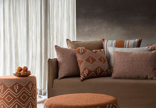
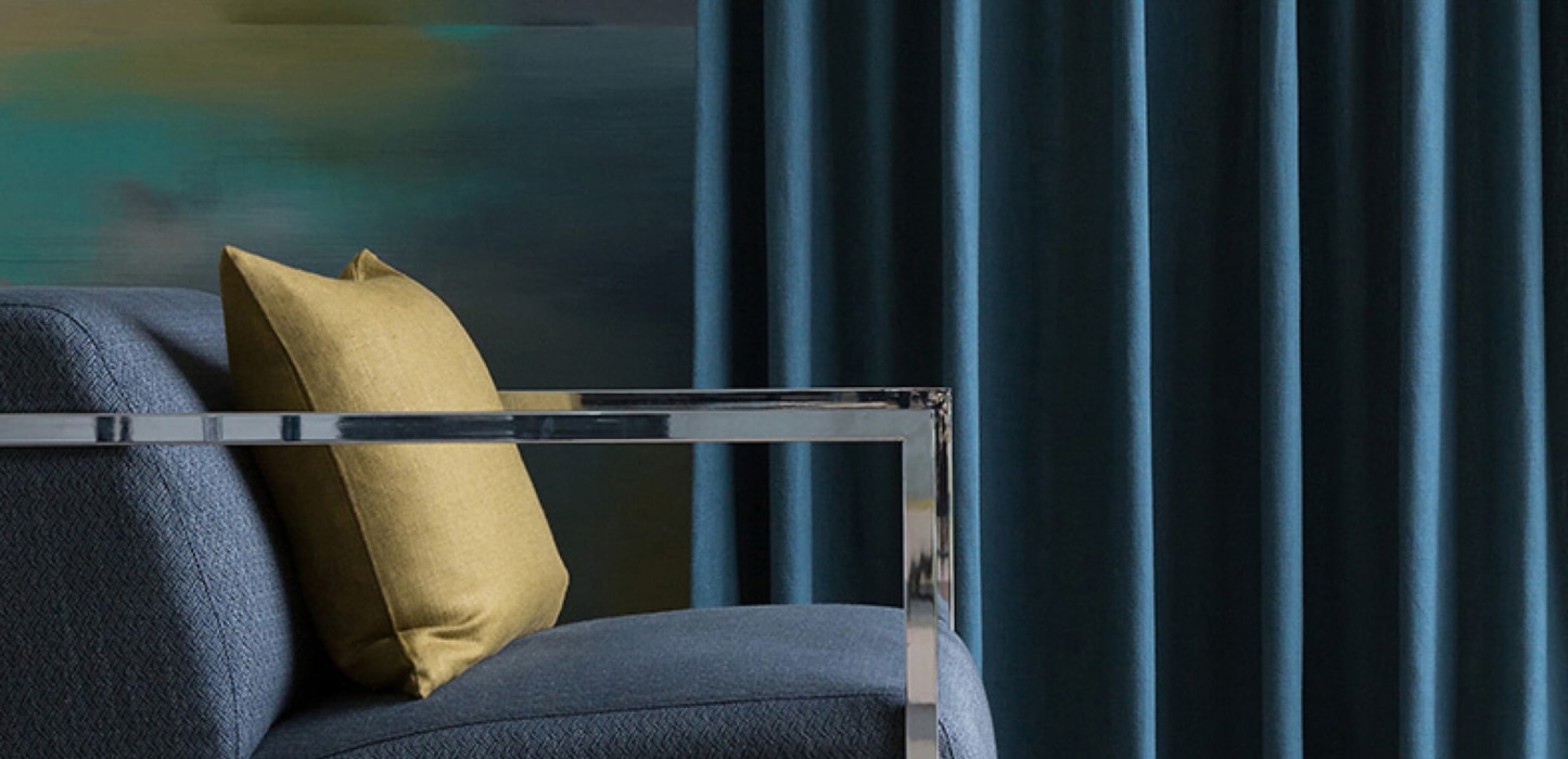
Bold blue works with all kinds of architecture and is easy to live with, as opposed to reds or yellows which can overwhelm the room. Blue also looks good with more blue. Plenty of texture and layers will help to soften the boldness so you don’t end up with a stark palette; Like in this room where the texture and sheen of the fabric adds depth rather than ‘just more blue’.
Tip
"Instilling calm, confidence, and connection, this enduring blue hue highlights our desire for a dependable and stable foundation on which to build as we cross the threshold into a new era.” Pantone.com
Using bold blue in your home
Use blue to create a tranquil bedroom or stimulating thinking space, or to cool down the warmest (north facing) rooms of the house.
What does blue go well with?
- Bold blue pairs well with natural materials, which keep the look fresh and grounded.
- Choose woods with yellow or gold undertones
- Whitewashed walls (think Santorini, Greece)
- Other shades of blue
- Concrete grey
- Beachy beige
- Sunny yellow
- Intense pink
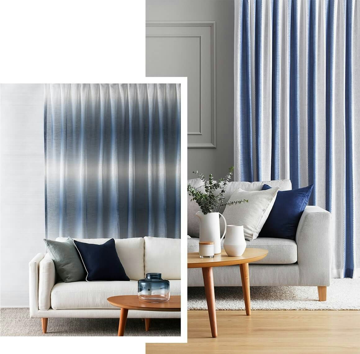
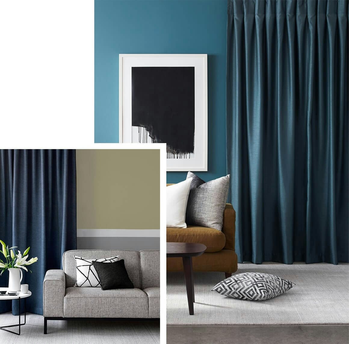
Blue curtains for white walls
Which shade of white paint works best with will depend on your exact shade of blue, but it will likely need to be a cool, clean white such as Dulux Haumoana.
As for curtains and soft furnishings, there’s always a stripe in vogue at any given time; like these two fabrics from the James Dunlop Essentials collection. Aside from the pop of blue they bring, here, the vertical stripe works to make the room seem larger. And we love the hazy softness of the horizontal stripe.
Get the look
Here are our top fabric picks to help you achieve this stye trend in your home. Ask to see these fabrics when you book your free style consultation.
Download our free fabric inspiration guide
Get great styling tips and see examples of some of our most popular fabrics.
Fabric inspiration

Elevation by James Dunlop
The light and fresh colour palette of this room lets the blue take the lead without feeling oppressive.

Stratos by James Dunlop
Refined yet interesting, this two-tone linear patterned fabric plays on the light and shadow of its waves while its crushed texture look gives it character.

Apollo by James Dunlop
This fabric’s cloud-like pattern would make a dreamy bedroom.

Fresco from Russells Designer Range
This room shows how sophisticated fabrics and materials with sheen, in a calming yet refreshing colour palette, work well in contrast with hard industrial surfaces.

Sloane by James Dunlop
Proving this colour palette will work across architecture styles, this fabric draws inspiration from classic colonial textiles., giving it a timeless quality.

Coast Pacific by Warwick
A completely different look again – quite light and beachy - but using the same colour palette; we like how you can keep it simple but still be interesting.